Customization
Colors
setBackgroundColor(Color(0xFF785EF0))
setArrowColor(Color.White)  // Color.Unspecified inherits the background
setAlpha(0.9f)
setAlpha applies to the whole balloon in one layer, so overlapping parts do not double blend.
Border
setBorder(color = Color.White, thickness = 2.dp)
setBalloonStroke(color = Color.White, thickness = 2.dp)  // same thing, 1.x name
The stroke traces the real silhouette, arrow included, at exactly the thickness you asked for.
Leave borderColor at Color.Unspecified or borderThickness at 0.dp to disable it.
Content
The balloon body is a Compose slot, so there is nothing to configure on the builder. Build it with the same composables you use everywhere else.
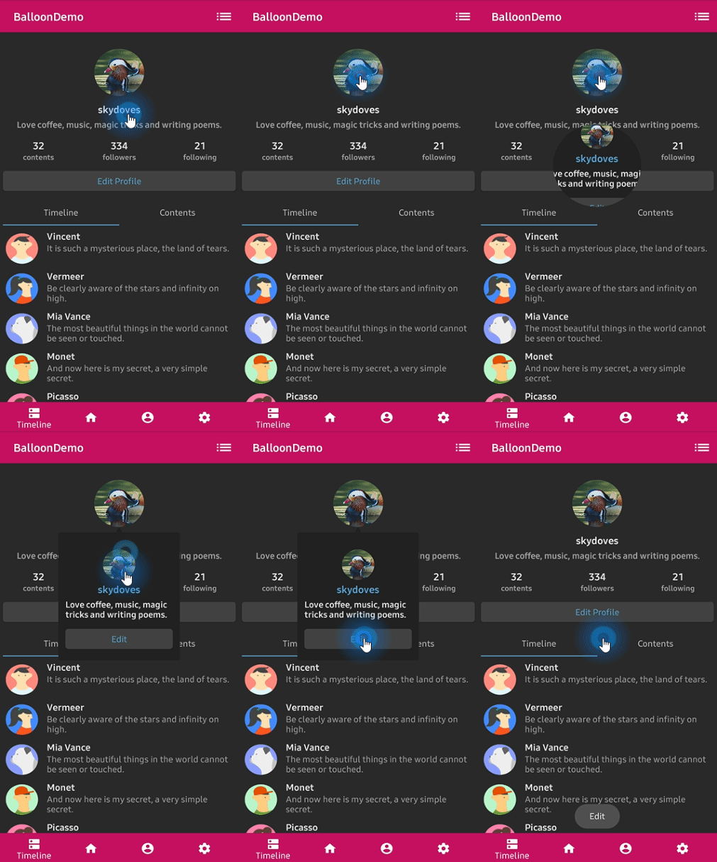
Balloon(
    state = balloonState,
    balloonContent = {
        Column {
            Text(
                text = "Choose a drink",
                color = Color.White,
                style = MaterialTheme.typography.titleSmall,
            )
            Spacer(modifier = Modifier.height(8.dp))
            drinks.forEach { drink ->
                Row(
                    modifier = Modifier
                        .fillMaxWidth()
                        .clickable { onDrinkSelected(drink) }
                        .padding(vertical = 6.dp),
                    verticalAlignment = Alignment.CenterVertically,
                ) {
                    Icon(painter = painterResource(drink.icon), contentDescription = null)
                    Spacer(modifier = Modifier.width(8.dp))
                    Text(text = drink.name, color = Color.White)
                }
            }
        }
    },
) {
    Button(onClick = { balloonState.showAlignBottom() }) { Text(text = "Drinks") }
}
Interactive content works normally. A tap that a child consumes never reaches the balloon's own
tap handler, so a clickable row inside the body does not accidentally trigger
setDismissWhenClicked.
Reusing a style
BalloonStyle is immutable, and derive makes a variant that changes only what you name:
val base = rememberBalloonBuilder {
    setCornerRadius(8.dp)
    setPadding(12.dp)
    setBackgroundColor(Color(0xFF785EF0))
}

val warning = base.derive { setBackgroundColor(Color(0xFFFF6F00)) }
val subtle = base.derive {
    setAlpha(0.85f)
    setArrowSize(8.dp)
}
derive takes the same builder block as rememberBalloonBuilder, starting from an existing
style instead of the defaults. It exists instead of a data class copy because a generated
copy would name all 43 properties in the published binary interface and make adding a 44th
option a breaking change.
DefaultBalloonStyle is the same value the builder produces with no calls, which makes a
convenient starting point.
Restyling a visible balloon
rememberBalloonState re-applies the style on every recomposition, so an animated style updates
a balloon that is already showing without hiding it:
val color by animateColorAsState(if (selected) Color(0xFF785EF0) else Color(0xFF444444))
val balloonState = rememberBalloonState(style.derive { setBackgroundColor(color) })
Behavior
setDismissWhenClicked(true)  // tapping the body closes it
setDismissWhenTouchOutside(true)  // tapping outside closes it
setDismissWhenBackPressed(true)  // back or Escape closes it
setDismissWhenShowAgain(true)  // showing a visible balloon closes it instead
setDismissWhenTouchMargin(true)  // a tap in the margin band closes it too
setDismissWhenOverlayClicked(true)  // tapping the scrim closes it
setAutoDismissDuration(2_000L)  // 0L disables
setFocusable(true)
Two of these carry side effects, kept from 1.x so ported call sites behave the same:
setDismissWhenTouchOutside(false)also clears focusability, so a balloon that ignores outside taps does not sit there swallowing themsetBalloonAnimation(BalloonAnimation.CIRCULAR)also clears focusability, so the reveal can play without the popup stealing input
Call setFocusable(true) after either one if you want focus back.
Accessibility
Balloon content is marked with an unmergeable semantics property, so a screen reader treats it as its own subtree instead of folding it into a clickable ancestor. Give the content itself meaningful semantics the way you normally would:
balloonContent = {
    Text(
        modifier = Modifier.semantics { liveRegion = LiveRegionMode.Polite },
        text = "Now you can edit your profile!",
    )
}