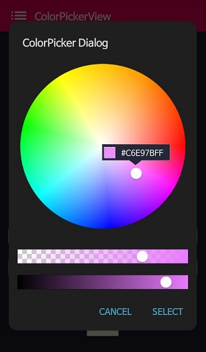
ColorPickerDialog
ColorPickerDialog provides a ready-to-use dialog for color selection, similar to Android's AlertDialog.
Basic Usage
ColorPickerDialog.Builder(this)
    .setTitle("ColorPicker Dialog")
    .setPreferenceName("MyColorPickerDialog")
    .setPositiveButton("Confirm", ColorEnvelopeListener { envelope, fromUser ->
        setLayoutColor(envelope)
    })
    .setNegativeButton("Cancel") { dialogInterface, _ ->
        dialogInterface.dismiss()
    }
    .attachAlphaSlideBar(true)
    .attachBrightnessSlideBar(true)
    .setBottomSpace(12)
    .show()
new ColorPickerDialog.Builder(this)
    .setTitle("ColorPicker Dialog")
    .setPreferenceName("MyColorPickerDialog")
    .setPositiveButton(getString(R.string.confirm),
        new ColorEnvelopeListener() {
            @Override
            public void onColorSelected(ColorEnvelope envelope, boolean fromUser) {
                setLayoutColor(envelope);
            }
        })
    .setNegativeButton(getString(R.string.cancel),
        new DialogInterface.OnClickListener() {
            @Override
            public void onClick(DialogInterface dialogInterface, int i) {
                dialogInterface.dismiss();
            }
        })
    .attachAlphaSlideBar(true)
    .attachBrightnessSlideBar(true)
    .setBottomSpace(12)
    .show();
Builder Methods
| Method | Description |
|---|---|
setTitle(String) |
Sets the dialog title |
setPreferenceName(String) |
Sets a preference name for state persistence |
setPositiveButton(String, ColorEnvelopeListener) |
Sets the positive button with a color listener |
setNegativeButton(String, OnClickListener) |
Sets the negative button with a click listener |
attachAlphaSlideBar(Boolean) |
Attaches an alpha slider (default: true) |
attachBrightnessSlideBar(Boolean) |
Attaches a brightness slider (default: true) |
setBottomSpace(Int) |
Sets bottom space between the last slider and buttons |
Customizing the ColorPickerView
You can get the ColorPickerView instance from the builder to customize it:
val builder = ColorPickerDialog.Builder(this)
    .setTitle("ColorPicker Dialog")
    .setPositiveButton("Confirm", ColorEnvelopeListener { envelope, fromUser ->
        // Handle color selection
    })
    .setNegativeButton("Cancel") { dialog, _ ->
        dialog.dismiss()
    }

// Get the ColorPickerView and customize it
val colorPickerView = builder.colorPickerView
colorPickerView.setFlagView(CustomFlag(this, R.layout.layout_flag))
colorPickerView.setInitialColor(Color.RED)

// Show the dialog
builder.show()
Setting Initial Color
To set an initial color for the dialog:
val builder = ColorPickerDialog.Builder(this)
    .setTitle("Select Color")
    .setPositiveButton("OK", ColorEnvelopeListener { envelope, _ ->
        // Handle selection
    })
    .setNegativeButton("Cancel") { dialog, _ -> dialog.dismiss() }

// Set initial color
builder.colorPickerView.setInitialColor(currentColor)

builder.show()
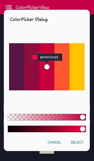
Custom Palette
You can use a custom palette image in the dialog:
val builder = ColorPickerDialog.Builder(this)
    .setTitle("Pick from Image")
    .setPositiveButton("Select", ColorEnvelopeListener { envelope, _ ->
        selectedColor = envelope.color
    })
    .setNegativeButton("Cancel") { dialog, _ -> dialog.dismiss() }

// Set custom palette
builder.colorPickerView.setPaletteDrawable(
    ContextCompat.getDrawable(this, R.drawable.my_palette)
)

builder.show()
Without Sliders
You can create a simpler dialog without the alpha and brightness sliders:
ColorPickerDialog.Builder(this)
    .setTitle("Simple Color Picker")
    .setPositiveButton("OK", ColorEnvelopeListener { envelope, _ ->
        // Handle selection
    })
    .setNegativeButton("Cancel") { dialog, _ -> dialog.dismiss() }
    .attachAlphaSlideBar(false)
    .attachBrightnessSlideBar(false)
    .show()
State Persistence
The dialog can automatically save and restore the last selected color:
ColorPickerDialog.Builder(this)
    .setTitle("ColorPicker Dialog")
    .setPreferenceName("MyColorPickerDialog") // Enable state persistence
    .setPositiveButton("OK", ColorEnvelopeListener { envelope, _ ->
        // The selected color will be remembered
    })
    .setNegativeButton("Cancel") { dialog, _ -> dialog.dismiss() }
    .show()
The next time the dialog opens, it will show the previously selected color.
Complete Example
class MainActivity : AppCompatActivity() {

    private var selectedColor: Int = Color.WHITE

    override fun onCreate(savedInstanceState: Bundle?) {
        super.onCreate(savedInstanceState)
        setContentView(R.layout.activity_main)

        findViewById<Button>(R.id.selectColorButton).setOnClickListener {
            showColorPickerDialog()
        }
    }

    private fun showColorPickerDialog() {
        val builder = ColorPickerDialog.Builder(this)
            .setTitle("Select Color")
            .setPreferenceName("MainColorPicker")
            .setPositiveButton("Confirm", ColorEnvelopeListener { envelope, fromUser ->
                selectedColor = envelope.color
                updateUI(envelope)
            })
            .setNegativeButton("Cancel") { dialog, _ ->
                dialog.dismiss()
            }
            .attachAlphaSlideBar(true)
            .attachBrightnessSlideBar(true)
            .setBottomSpace(12)

        // Customize the ColorPickerView
        val colorPickerView = builder.colorPickerView
        colorPickerView.setFlagView(BubbleFlag(this).apply {
            flagMode = FlagMode.FADE
        })

        builder.show()
    }

    private fun updateUI(envelope: ColorEnvelope) {
        findViewById<View>(R.id.colorPreview).setBackgroundColor(envelope.color)
        findViewById<TextView>(R.id.hexCodeText).text = "#${envelope.hexCode}"
    }
}