Text and Icon
This guide covers how to customize the text and icon content of your Balloon tooltips.
Text Configuration
Basic Text
Balloon.Builder(context)
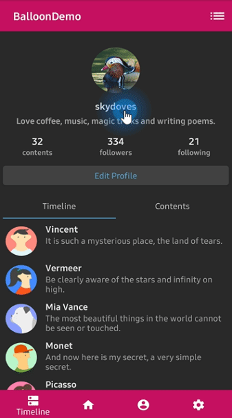
.setText("Edit your profile here!")
.setTextSize(15f)
.setTextColorResource(R.color.white)
.setTextGravity(Gravity.START)
.setTextTypeface(Typeface.BOLD)
HTML Text
If your text contains HTML tags, enable HTML rendering:
Balloon.Builder(context)
    .setText("<b>Bold</b> and <i>italic</i> text")
    .setTextIsHtml(true)
Auto-Sized Text
Enable auto-sizing to fit text within the Balloon window:
Balloon.Builder(context)
    .setTextSize(15f)
    .setMinAutoSizeTextSize(14f)
    .setMaxAutoSizeTextSize(18f)
    .setEnableAutoSized(true)
Note
Ensure the maximum auto text size is higher than the minimum auto text size.
TextForm
TextForm allows you to create reusable text configurations that can be applied to multiple Balloons.
Create TextForm
val textForm = TextForm.Builder(context)
    .setText("Edit your profile here!")
    .setTextColorResource(R.color.white)
    .setTextSize(14f)
    .setTextTypeface(Typeface.BOLD)
    .build()
val textForm = textForm(context) {
    setText("Edit your profile here!")
    setTextColorResource(R.color.white)
    setTextSize(14f)
    setTextTypeface(Typeface.BOLD)
}
TextForm textForm = new TextForm.Builder(context)
    .setText("Edit your profile here!")
    .setTextColorResource(R.color.white)
    .setTextSize(14f)
    .setTextTypeface(Typeface.BOLD)
    .build();
Apply TextForm
Balloon.Builder(context)
    .setTextForm(textForm)
Icon Configuration
Basic Icon
Balloon.Builder(context)
    .setIconDrawableResource(R.drawable.ic_edit)
    .setIconSize(20) // icon size in dp
    .setIconSpace(10) // margin between icon and text
    .setIconColorResource(R.color.white)
    .setIconGravity(IconGravity.START) // START, END, TOP, BOTTOM
Icon Gravity
Control where the icon appears relative to the text:
IconGravity.START // icon on the left (LTR)
IconGravity.END // icon on the right (LTR)
IconGravity.TOP // icon above text
IconGravity.BOTTOM // icon below text
IconForm
IconForm allows you to create reusable icon configurations.
Create IconForm
val iconForm = IconForm.Builder(context)
    .setDrawable(ContextCompat.getDrawable(context, R.drawable.arrow))
    .setIconColor(ContextCompat.getColor(context, R.color.skyblue))
    .setIconSize(20)
    .setIconSpace(12)
    .build()
val iconForm = iconForm(context) {
    setDrawable(ContextCompat.getDrawable(context, R.drawable.arrow))
    setIconColor(ContextCompat.getColor(context, R.color.skyblue))
    setIconSize(20)
    setIconSpace(12)
}
IconForm iconForm = new IconForm.Builder(context)
    .setDrawable(ContextCompat.getDrawable(context, R.drawable.arrow))
    .setIconColor(ContextCompat.getColor(context, R.color.skyblue))
    .setIconSize(20)
    .setIconSpace(12)
    .build();
Apply IconForm
Balloon.Builder(context)
    .setIconForm(iconForm)
Custom Layout
For complex layouts, you can use a custom layout file:
val balloon = Balloon.Builder(context)
    .setLayout(R.layout.layout_custom_balloon)
    .setArrowSize(10)
    .setArrowOrientation(ArrowOrientation.TOP)
    .setArrowPosition(0.5f)
    .setWidthRatio(0.55f)
    .setHeight(250)
    .setCornerRadius(4f)
    .setBackgroundColorResource(R.color.black)
    .setBalloonAnimation(BalloonAnimation.CIRCULAR)
    .setLifecycleOwner(lifecycleOwner)
    .build()
Access Custom Views
After building the Balloon with a custom layout, you can access the views:
val button: Button = balloon.getContentView().findViewById(R.id.button_edit)
button.setOnClickListener {
    Toast.makeText(context, "Edit clicked", Toast.LENGTH_SHORT).show()
    balloon.dismiss()
}